Tiger Brands Spent R500K on a Rebrand That Impresses Designers and Confuses Grandmothers
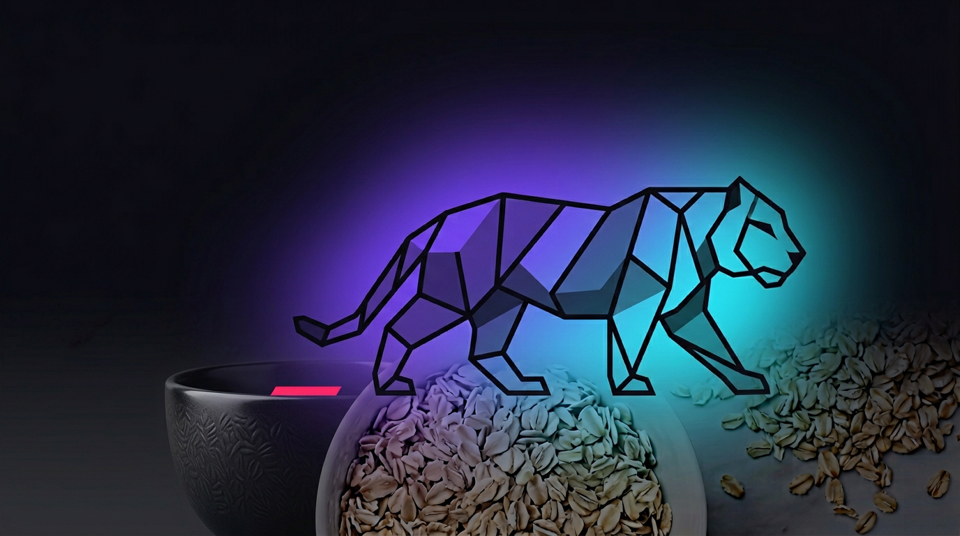
Tiger Brands recently launched their first corporate rebrand in 25 years. New geometric logo. New #WhoEverTheExplorer positioning. A modernization narrative that signals corporate evolution.
We ran three Tiger Brands assets through Buyology Labs — the new corporate logo, Jungle Oats packaging, and Jungle Instant Oats packaging — using six virtual neuroscience devices and a 50-point behavioral science audit backed by published research.
The verdict is nuanced. And that is what makes it valuable.
The Logo — Sophistication vs Recognition
The new geometric tiger logo scores well where it should: cultural resonance at 82/100 and color fit at 81/100. Preserving the heritage red-black combination protected 25 years of neural pathway equity. The modernization story resonates, particularly in urban provinces.
Where it struggles is archetype alignment at 68/100. Tiger Brands is fundamentally an Everyman brand. Moms buying groceries. Kitchen tables, not boardrooms. The geometric abstraction signals Creator or Ruler — corporate sophistication that impresses design award judges but creates emotional distance from the consumer who needs to trust this brand at shelf level.
Processing fluency scores 74/100. That sounds adequate until you consider that shoppers have 0.3 seconds to recognize a brand in a retail environment. Every millisecond spent decoding whether those interlocking geometric shapes represent a tiger is cognitive effort that competitors do not demand.
The geographic data tells the real story. Western Cape scores 78. Gauteng scores 76. But Limpopo drops to 67 and Eastern Cape to 69. An 11-point gap between urban and rural provinces means this rebrand works in Sandton but may alienate rural markets where literal, warm imagery drives purchase decisions — and where significant volume actually lives.
The Packaging — Where Brand Promise Meets Shelf Reality
A logo is a promise. Packaging is the delivery. If they do not align neurologically, you have a brand identity crisis at the most critical moment — point of purchase.
Jungle Oats scores 66/100 on NeuroScore, ten points above the FMCG category average of 56. Instant Oats scores 60/100, four points above average. Both above average, but above average in a category where the average is mediocre is not a celebration.
The tiger mascot is Jungle Oats' strongest neural asset. Face detection advantage means the brain captures it within 100ms — faster than any text, price point, or promotional flash on the same shelf. Memory encoding scores 73/100 for Jungle Oats, driven almost entirely by that mascot.
Then the packaging fights itself.
Cognitive load scores 53/100 for Jungle Oats and 40/100 for Instant Oats. Our GSR workload model flagged Jungle Oats at 90 percent cognitive load. To put that in context, anything above 80 percent means the brain is treating your packaging like a maths problem, not a shopping decision.
The front panel of Jungle Oats contains brand name, tagline, product claims, nutritional information, heart health symbols, heritage badge, energy champion positioning, and product imagery — all competing for attention in a 3-second shelf scan window. Published research from Iyengar and Lepper demonstrated that choice overload reduces purchase probability by 24 percent. The same principle applies to information overload on a single pack face.
CTA effectiveness scores 45/100 and 40/100 respectively. Below 50 means the packaging creates interest but fails to convert it into a hand reaching for the shelf. The desire is there. The action pathway is blocked by cognitive friction.
The Behavioral Science Violations
Our 50-principle behavioral science audit flagged consistent violations across all three assets.
Processing Fluency: When information is hard to process, the brain perceives it as less trustworthy and less likeable. Both packaging designs violate this principle significantly. The fix is structural — reduce front-panel elements to 3-4, increase whitespace by 40 percent, and let the tiger mascot dominate.
Loss Aversion: All Tiger Brands messaging uses pure gain framing — Energy Champion, convenience benefits, positive nutrition. Published research consistently shows that loss framing is twice as motivating. "Don't start your day weak" triggers stronger neural responses than "Get energy."
Social Proof: "The Original Favourite" is an unquantified claim. Without specific numbers — "Chosen by 2.3 million South African families" — it functions as decoration rather than persuasion.
Peak-End Rule: Neither packaging design creates a memorable peak moment. The visual experience is uniformly dense from top to bottom, violating the principle that people judge experiences by their peak intensity and their ending.
The Verdict — Competent but Forgettable
Tiger Brands' rebrand is not a failure. The cultural resonance score of 82 on the logo confirms the modernization narrative works. The color equity preservation was the right call. The tiger mascot remains one of the strongest brand assets in South African FMCG.
But there is a measurable gap between what the brand signals and what the packaging delivers. The logo promises corporate evolution. The packaging delivers information overload. The brand story says explorer. The shelf experience says encyclopedia.
The fix is not a second rebrand. It is a systematic reduction of cognitive friction at every consumer touchpoint — fewer elements per pack face, stronger visual hierarchy, loss-framed messaging where gain framing currently dominates, and quantified social proof replacing vague heritage claims.
These are not aesthetic opinions. They are measurable gaps between how the brain processes information and how these assets present it.
Methodology
This analysis was conducted using Buyology Labs' virtual neuromarketing platform — six AI neuroscience devices calibrated against real published datasets including NeuMa (42-subject EEG, AUC 0.746), 50-point behavioral science audit, and research-backed domain context from published packaging neuroscience, color psychology, and shelf psychology studies. The Logo and Brand Identity analysis uses 12 neuroscience-backed dimensions including processing fluency, shape-emotion alignment, color neurological fit, typographic voice, Gestalt integrity, semiotic depth, negative space intelligence, golden ratio conformance, archetype alignment, scalability, memory encoding potential, and cultural resonance.
Ready to see how your creative performs?
Get your free analysis at buyologylabs.com